Client Review: We came to know Jaeden from Aiidee through a friend’s recommendation and they sure did an outstanding job! Jaeden is very experienced, patient and meticulous. He and his team are super easy to work with, reliable and great problem solvers! Whenever there is an issue, they will go all out to help us resolve it. We are very happy with the overall outcome and would highly recommend them to anyone looking for Interior Designers!
We pieced together a modern yet luxurious space. A crib where users can rest after a long day at work. Minimal space, maximum utility with almost a full kitchen set.
Serenity.
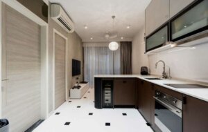
Once stepped into this modern cosy home, this is the sight you get, having the patterned pendant light reflecting throughout, further enhancing the atmosphere of the home. A cool and serene place to rest over the weekends.
Cook in the mood.
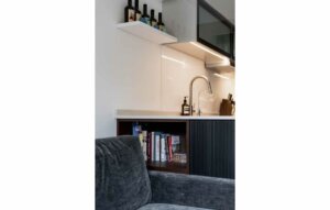
Even the kitchen has a mood for it. This kitchen does not only serve as a place to cook delicious meals but also a place to have breakfast on this island that connects to the appliances.
Full Kitchen.
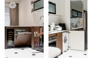
A functional set of cabinets. Aesthetic and functional, keeping it, all hidden in the cabinet. Reaching out to all appliances and ingredients with ease. It is something that we always keep in mind when designing a kitchen. Here, we have an integrated dishwasher than combines seamlessly with the cabinets, a wine chiller tucked under, a pull-out sauce unit for your sauces and spices and a washing machine behind all these carpentry.
No space wasted.
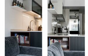
A dual- function Island; Due to space constraints, we did not have much space to fit a side table hence we made use of the un-use space at the island to act as a side table instead. A talking point of this home!
Muted but not dull.
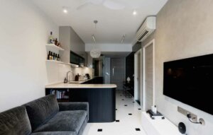
The lighting in this home plays a huge part to its mood. With warm white and cool white colour temperatures, it settles in an atmosphere that helps the space look too dimmed. The subtle lights allow unique surfaces like the Stucco painted wall on the TV wall and velvet sofa bed stand out but not outshine the rest of the other areas.
Featured Walls.
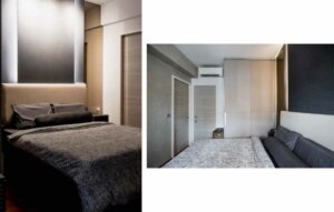
Previously, it was a bulky cushion that falls over frequently. To aid in this issue, we left the headboard intact but switched out the cushion and customized to one that fit into the headboard perfectly, having it not fall over anymore.
Moreover, on the opposite of the wall, we have another full fledge Stucco painted wall, this helps the room look a lot more furnished rather than just a plain white wall that looks bare.
Desk for 2.
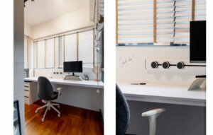
An area that we altered. It was supposedly an L- Shaped Table and we decided to take it down to craft out a 2- seater study table instead. Moreover, rather than having drawers attached to the table, we suggested the users to get a loose pedestal instead. This doesn’t only aid visually but also comfort-wise. It does not look as bulky as before and it has increased the leg room for the user to sit comfortably.
Also, the backing of this desk is a white board that you can scribble on it!
Sophia Hills | 2 Bedroom Condominium
Modern Luxury
Floor Area: 600 sqft
Project Cost: $19k
