Living room design
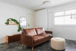
Our take in the mix of design themes brings harmony of moods, all contained within a crib cohesively. Let us welcome you into this twist of Mid Modern Century.
This minimal enclosure is a pairing of two tones may cause a clash at times but with our detailed selection of furniture, we managed to put out a minimal and serene space to be welcomed into. In this case, dark furniture as put in place to bring forward the design language of Mid Modern Century. Plus, with a tinge of greenery.
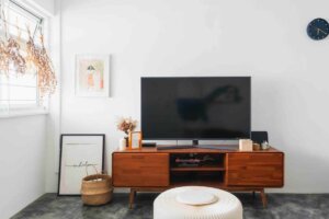
Apart from the furniture and walls, the floor is also a highlight of the space. We created such flooring with an innovative way of mixing several liquids, creating a very prominent element. Hence, crafting out a one- of- the- kind space.
New look of the bed rooms
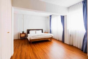
Following into the rooms, you will be stepping onto a ground of serenity. This selection of colors, dark wood and white is muted but provides a sense of coziness, waking up to a brand-new day ahead. Adding on, you have day curtains to mellow and fix down the mood of not having too much brightness in the space, a real sense of coziness.
Common Bathroom
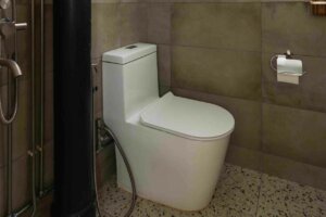
Next for Common Bathroom, we picked this monochromatic tone, welding perfectly with the prominent flooring we have for the living room. Moreover, many would feel that the pipe on the side may be an eye sore but, in this case, we painted it black to bring out the monochrome effect more.
Attractive kitchen area
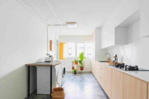
Moving on to the Kitchen, we have concluded with white as we felt that it always put up a clean crisp look, and may even elongate your space better. Then, completing the look with a texture surface, adding more warmth and dynamic into the space.
Different look of the wall and switches
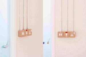
We spare no corners, rather than picking the usual boring ducting and residential switches, we proposed PVC Pipes and this kind of switches instead, including some industrial taste to it. How different is it from the mediocre!
Master Bathroom
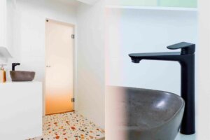
Last but not least, the Master Bathroom, we crafted an elevated vanity with a splash of terrazzo, a small contrast to the other parts of the home. But also, not totally excluding the monochromatic portion by having the choice of a cement- like tone basin.
Client Testimonial:
Project Name: 811 Tampines
Place: 811 Tampines
We engaged Yew Koon as our ID for our very first home. Yew Koon is meticulous, with a keen eye for detail. He was able to provide the materials and colors that fit the vision and inspiration of our home. We are lucky to have him as our interior designer, especially when the Circuit Breaker suddenly happened. He was very dependable and resourceful in ensuring that we do not get affected too much by the lack of manpower and building materials during that period.
Our neighbor also sang praises of him for visiting our home daily to ensure the renovation work was well done. He also managed to help us keep the cost down to our budget without compromising on our requirements.
Post-renovation, he was also very helpful in arranging for a few rounds of touch-ups and minor repairs of our home, without additional costs.
We’d highly recommend Yew Koon to anyone who is looking for a trustworthy and capable interior designer. 5 stars! 👍
811 Tampines | 4 Room Resale HDB
Mid Modern Century
Floor Area: 980 sqft
Project Cost: $48k
