This 4 Room Condominium is a medley of modern and dark tones, a timeless and non-mundane enclosure. Get wowed not just by the amazing sea view but also by the straight-cut TV feature wall. These paneled strips are not just for aesthetics but also a way to elongate the space, an illusion to have your space look spacious! Furthermore, with open niches, we further emphasize the theme of the mid modern century.
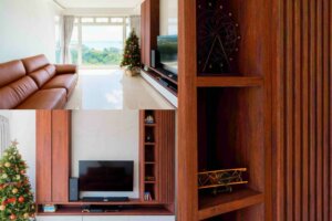
Moving on to one of the major works in this place is carpentry.
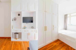
We are not having the usual sleek carpentry this time round. Instead, a modern Victoriana one. For such a design, we then have to be more detailed in the carpentry. We meticulously selected gold-finished handles to complete the look!
When designing, we always keep in mind the site’s surroundings. In this room, there is the afternoon sun shining in and we felt that white would complement the sun very well. Hence, this choice of color. Moving on, carpentry need not just have 1 function. It can have more than 1, like the example below. Having a carpentry just for storing clothes would be great but we can make it even better by adding a niche to act as display shelves, dual function!
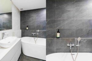
Next, for the bathroom. This color scheme is altered to not look harsh but gentle yet luxurious. Just white could seem a bit stark, which is why we broke up the monotony with some grey- stone alike surfaces. Rather than tiling up all 4 walls with the same finish, we laid a lighter shade to slot some liveliness in it. For storage wise, we filled in the gap between them to create a functional ledge. Many would feel that columns like this are a barrier to design but we do not feel so, rather, we work around what we have and possibly add some functions to existing elements like this. This would be a way to place your toiletries and it is within reach.
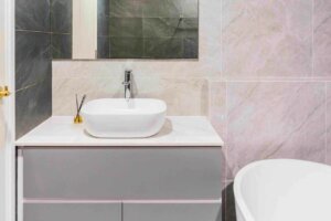
Many would pick an under-mount sink. But a top basin would be another option. There is more counter space and you wouldn’t be afraid if any of your smaller knick-knacks are to fall into the basin drain.
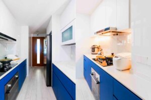
Finally, the kitchen. We reworked the entire space for it. Again, with the mid-modern century theme in mind, we picked a color that is leaning toward the theme. Having a two-tone kitchen rather than just one gives more character and having a brighter top cabinet helps to reduce some rigidity of the area too.
To conclude, this project is one of which is a full renovation, touching on different materials and then deciding on one. Crafting this beautiful space!
Project Name: Costa Del Sol
Place: Costa Del Sol
Client Testimonial:
Did a full renovation of my new place last year with Jaeden. Pricing was transparent and communication was clear. What I appreciated a lot was the responsiveness of the team and the project was delivered within a reasonable timeframe too.
Costa Del Sol | 3 Bedroom Condominium |interior design project
Modern Luxury
Floor Area: 1,250 sqft
Project Cost: $65k
